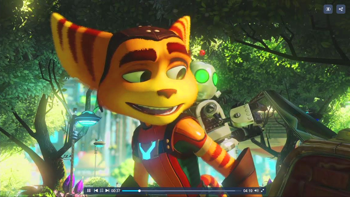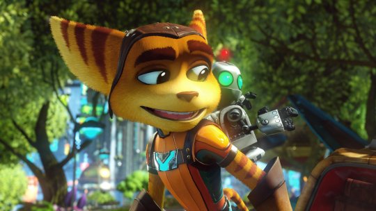

Two images: one pre-rendered, one in-game rendered. Which looks better?
i cant tell what one is which XD. the top one has better lighting with the glow on Ratchet's chest. but the bottom one has better use of blur. it's a tie for me
The top on is probably the pre-rendered one, since the bottom one seems to match a lot more with the in-game model of Ratchet as wells as the mettalic surface of Clank and his glowing antenna. The Clank's surface on the top one looks somewhat white like the PS2 games. They also look much more clear on the bottom.
As for which one I like better, it's a tie as well. The top one really has good lighting and the background has no blur, but everything on the second one looks more polished and with the use of blur to focus on Ratchet and Clank.
