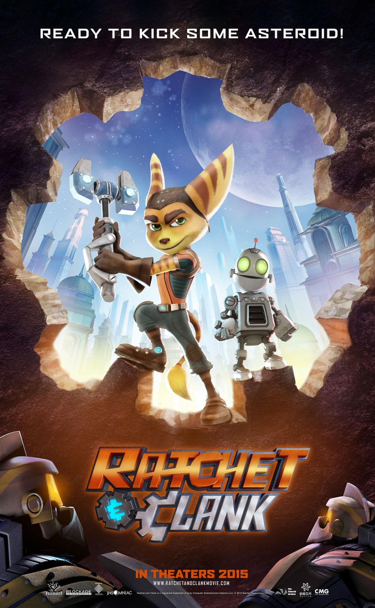
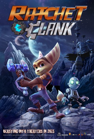
Over the course of a last few months some teaser posters for the movie reached the surface. Yesterday collider.com managed to get and share with us yet another one from this year's AFM (American Film Market).

The poster gives us yet another glimpse at the Metropolis, while also showing us some (most probably hostile) robots, pretty similar to those seen in Ratchet: Deadlocked. It's also worth noticing that Insomniac Games logo appears alongside the companies that made the movie. It is unknown if this is going to be used as movie's official poster in the future.
Those of you who missed the previous posters, here they are as well:


What else's out there
> Check Kevin Munroe's (the movie's director) instragram page to see some of his fun Ratchet & Clank halloween sketches, including Frankenclank and 'Qwark Busters'.
> Visit Yancy Young's blog, where you can find some really nice art from the last Ratchet & Clank games made by this Insomniac artist.
> Ever wondered how does Thugs sound in different languages? No? Oh well, check the Ratchet & Clank: Into the Nexus Multilanguage video anyway.
Yeah, but there's something weird about it's colors… That's why I used this one.
So hum, can we tone down the "We beat the french site" thing? It's not a race, besides it's not that big a deal the second time.
I'm not racing them, I saw a new poster and made a news about it. It doesn't matter if they wrote about it earlier or later, what matters is that I didn't do that two weeks fter it was shown
@Kubak12 "
"
"I'm not racing them, I saw a new poster and made a news about it. It doesn't matter if they wrote about it earlier or later, what matters is that I didn't do that two weeks fter it was shown
That was about a certain comment on the French version of this news article…
@Darkstar
"That was about a certain comment on the French version of this news article…"
Aw, that… Didn't notice it earlier. But yeah, I agree with you and RatchetBlaster.
@Kubak12
"Yeah, but there's something weird about it's colors… That's why I used this one."
If you turn up the saturation to 100%, it make the CMG poster look more vivid and balanced in color.
Oh, hum, what happened with this post?
What?
@Animovie Ratchet
"What?"
It just appeared empty, I edited it though.
The robot's jaw line actually IS the same, but their helmets are not-so…