The U.S. Playstation Blog has recently posted an entry (http://blog.us.playstation.com/2011/10/06/ratchet-clank-all-4-one-behind-the-box-art/) of the final box art of A4O. If you've paid attention, IG made an April Fools' joke cover, which was made in-universe style like the Qwark's drawn plans in the earlier games. So, IG and Sony went ahead of making the cover flippable, so if you flip the cover around, you'll get this: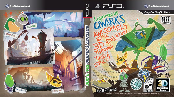
As you know, this is the final front cover as its front side up.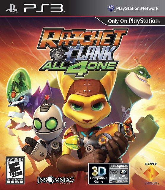
It also went through some evolution, also other than the ones posted earlier. You can also see one of the earlier logos for the game, it's somewhere after the Future subtitle was dropped off the 4 Play logo, but it's still clearly different.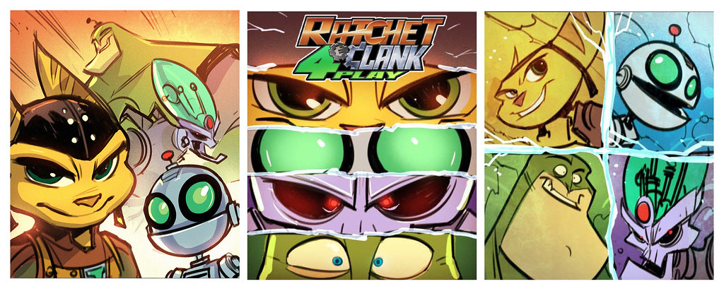
"This is the traditional, iconic movie-poster-style where you focus strongly on the characters’ faces. When it works, it’s because you know who they are. Note the game’s working title of “Ratchet & Clank: 4 Play,” which didn’t pass final approval for obvious reasons."
These already had the final logo: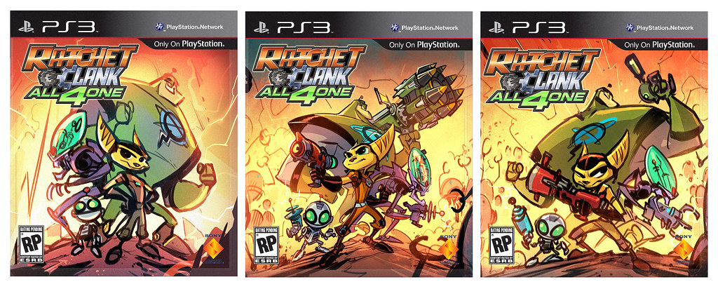
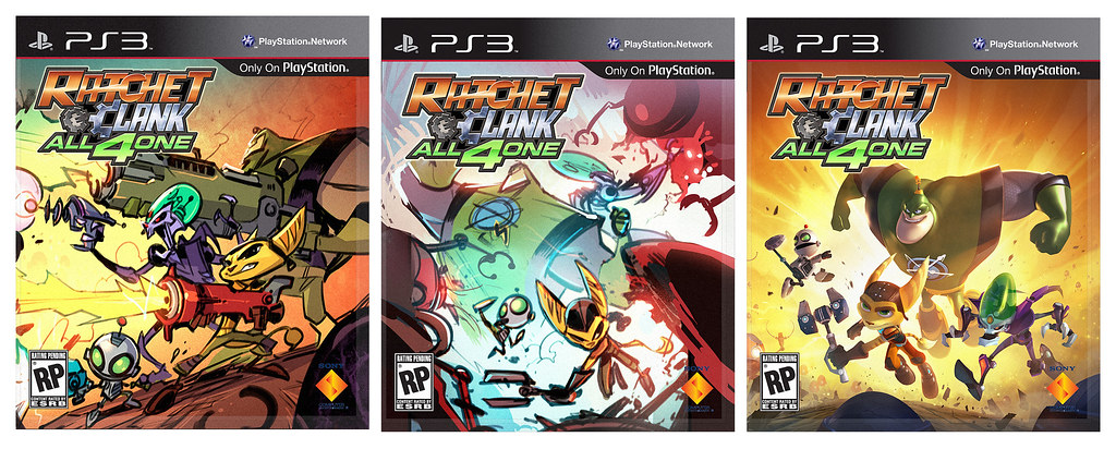
The last is one of the first if not the first to have made it to the real character renders stage.
At the fourth set the current cover saw the light of day in its earliest form. Here are the sketches: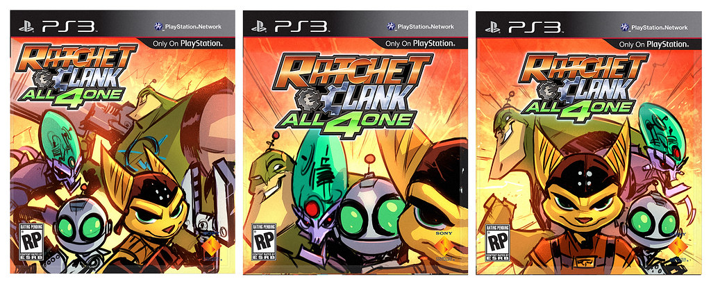
In my opinion it's interesting to note that the wrench drawn is the old Omniwrench 8000 or 3000 rather than the new 12k. It's probably easier to draw.
It's first version with character renders had to be changed because Ratchet looked mean in it. "This version is getting close, but we wanted Ratchet to sport a mischievous grin and instead he looks kind of… evil. We asked Dave to raise his head a bit and subtly brighten his eyes. We wanted him to look like he’s ready to kick butt, not like he’s going to kill you in your sleep!" Here it is: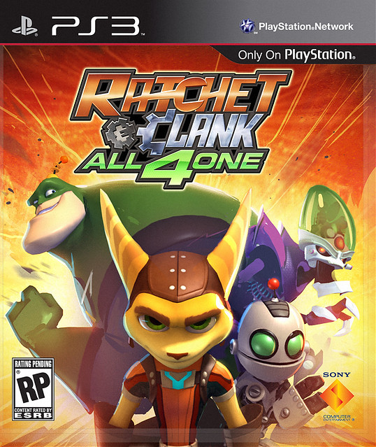
You can read the full story at the PS Blog site because I don't want to quote or re-write the whole text here. The main point was the old and different box artwork as well as the cover inlay.
I know there is a thread of the A4O cover art, but this is a lot more different, with all these sketch versions and such. To me it looked like it was only of the announcement of the box art itself.
But what do you all think of these? What would have been the best ones in your opinion?
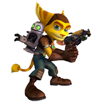
Uh oh! Ratchet is pulling off the creepy Alex expression from A Clockwork Orange in the first rendered box cover. 
Okay back to the topic.
It was okay for you to make this as it's own topic. You're right on the ball that the other thread was the announcement of the A40 box art, so making a topic about the behind concepts of the A4O cover as its own was a great choice to do.
Thanks for sharing all this detail to us orava (can I call you that?). Its amazing to see all the ideas that had to be thought up while processing the box art of the game. Even if Ratchet's facial expression in the first rendered box art may turn some people off because he looks "sinister" on the cover, but at the same time it's so amusing to see him in that expression. Wouldn't mind adding that as a recent icon one day. 
It's quite hard to choose which concept I would have wanted in the box cover other than the official only because the official A4O box art looks perfect to me. However, if I had to choose, the first one in the third row (where the characters are shooting their weapons at an angled perspective), or the second one in the second row (kind of the one that we'd see in the menu screen for anyone that played the beta version of the game).
Haha this is so awesome! I just saw this after work, and it makes me wonder if the special edition will come with that back-cover too…. o.O
Anyway, that is a very interesting article. I like seeing the developement art behind it too! Really awesome to see 
Messages: 50
Haha this is so awesome! I just saw this after work, and it makes me wonder if the special edition will come with that back-cover too…. o.O
Anyway, that is a very interesting article. I like seeing the developement art behind it too! Really awesome to see
I asked the same question on Insomniac's facebook page when they posted the article. I was replied to by another fan, who speculates that the Special Edition will indeed have the reverse cover.


I like their decision to have the same cover for both Europe and USA, as Europe has usually got worse covers (and then the Platinum re-release covers look awful with their yellow-and-silver colour combination when compared to the Greatest Hits' covers)
I personally would have liked the second row middle one, the one that was in the XMB background of the Beta. I hope we'll see it in the final game as well.
Sad news is that Canada isn't getting that inlay, so I fear Europe might not either. But if the Special Edition is going to be like the ACiT Collector's Edition, there won't be any inlay to begin with as the ACiT one was in a cardboard case far different from the normal PS3 boxes. Although it might be printed to the inside of the cardboard case.
Thanks for sharing all this detail to us orava (can I call you that?).
You can. BTW "orava" is Finnish word and means 'squirrel' (the European squirrel to be exact).
Sad news is that Canada isn't getting that inlay, so I fear Europe might not either. But if the Special Edition is going to be like the ACiT Collector's Edition, there won't be any inlay to begin with as the ACiT one was in a cardboard case far different from the normal PS3 boxes. Although it might be printed to the inside of the cardboard case.
Well too bad for me then, but then again, this is if you are really into these kind of packaging for a game.
You can. BTW "orava" is Finnish word and means 'squirrel' (the European squirrel to be exact).
Then European squirrel you shall be called!
just kidding. I'll just stick with orava then. It sounds awesome in my opinion.
Messages: 947
That's one nifty novelty cover!
They should have used my idea though…


