Today, while browsing the internet, I found 6 new images of Ratchet and Clank on Stockholm.design.com
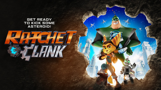
It appears that these 6 images were different attempts at creating the final poster for the movie.
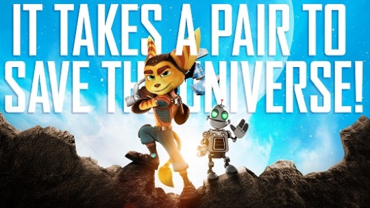
In fact, the original tagline for the poster was "It takes a pair to save the universe!"
You can see the other 4 variations of the poster by clicking the link above.
…and we thought "Kick Some Asteroid" was bad
They kind of look like action figures
Actually, that may be what they are.
@Animovie Ratchet "
"
"…and we thought "Kick Some Asteroid" was bad
What's so bad about it? You mean that it's better to have an annoying bad pun than not to have a pun at all?
Also, I think I like the original Ratchet version more than the one they used in the final poster.
I agree. But I see many more flaws with this one that are probably the reason for turning them down.
@Darkstar
"They kind of look like action figures
Actually, that may be what they are."
At first when I saw this I though they were action figures too. I even thought it was something about selling limited edition movie action figures or something like that.
@Darkstar ."
."
"They kind of look like action figures
+1.
My guess is that's because they are too shiny. However, if Ratchet and Clank action figures ended up looking that life-like, I'd be impressed!
Action figures or not, the main thing that bothers me is Ratchet's pose. That does not look like a comfortable position to have your head in. As far as I know, he's not an owl to be twisting his neck that much.
Another reason they probably ditched it: poor silhouette.
Yea, after seeing these posters I am glad they never got used as promotional material. The text and poses are all really odd.