Thread: New or Old Look?

Well,the old look had more detail and realistic look (not HD,3D look like in the new look)emoji
like the eyebrows.In the old look,it was more realistic.In the new look,it's now thick and fat and fully colored.emoji
ig they left it old BUT still added the HD,3D look,it would be perfect!emoji

————-This Is To Help,This Is NOT A Comment,Please Comment The Top Post————-

Just Compare:

User image
(New)

User image
(Old)

————-This Is To Help,This Is NOT A Comment,Please Comment The Top Post————-

Deleted user

Yes i defenently prefer the old ratchet, i don't really mind the Future ratchet, But i can't stand the A4O ratchet

The people at Insomniac had to change all the characters so that they
1.Stand out
2.Fit screen
3.Match the size

but yes,i agree,the A4O Ratchet is annoying…emojiemoji

Deleted user

I know, i mean ratchet size wouldn't be a problem just upscale the model, they didn't need to make them cartoonish simply make their clothing more colorful

They thought of that from the start,but then they realized (or thought) that since the other levels are greatly colored,they might as well do more to it
although they did make Ratchet more color full to stand out.They made his suit orange instead of brown to make him stand out more

The new one just looks more furry to me than the old model used in the games. Of course the one in the game covers and such looks good, but it can't be compared to an in-game model. Oddly enough the ToD model feels more furry to me than the ACiT model as the fur in it moves more naturally IMO. And the eyebrows are kind of a hardware limitation, remember they aren't that accurate on PS2.

The old model really looks horrible upscaled (I tried to emulate GC and upscale the resolution in the rendering to 3x and it looked simply too bad compared to the new model), since it isn't really done for HD. In upscaling the polygon count (ie. how smooth the curved surfaces look) stays same, and the textures have to be revised or they look absolutely horrendous. Something made for SD and then upscaled to HD looks just so plain bad when compared to a native HD 3D model. Especially parts just like eyebrows look really blocky. That model comparison you posted really isn't an upscaled PS2 model but a different one rendered for concept art and such if it even ever is a 3D model.

If a model like that is to be used it has to be made from scratch, as the model used in the PS2 games is just too polygonal and inaccurate for HD. See:
User image
There is no visible fur as the PS2 really wasn't powerful enough for that. It's only seen in promo art and such.
The old model has also big, out-of-proportion eyes and hands and a larger head than the new. The promo art model you posted a few posts earlier is actually closer to the PS3 than the PS2 model proportion-wise.

User image

User image


That promo art one is better compared to that (right-click and choose "view image" for larger:
User image
It's better defined, clearer and furrier than the one actually used in ToD.
This shows it better hence the picture size limit on the forums:
User image

But yeah, if the in-game model were like that UYA's promo-art one, I'd find it better. Especially those ears look furrier than in the new ones. The A4O model, on the other hand, has an awkward-sized and shaped head though, more like that in the drawn concept art.

A Crack in Time is my favourite R&C Design. Its well defined, vibrant, has good proportions, great outfit and is just nice to look at; The head especially.

@XoravaX
well,thee is more to graphic design than just making the image bigger
you can edit the resolution to 720 or even 1080p or more.
the editors at Insomniac could have done this easily
and the eye brows were meant to be like that from the start.The eye brows in R&CF are thick,too cartoony.
and also,the image i used to show the OLD ratchet is in HD format…it looks very clear.
now the furry thing…i figure your right,but in some cases.
In ratchet and Clank (1),he wasn't as furry.In Ratchet and Clank 2,he was sort of less furry than the last Ratchet.In R&C:UYA,he was furry and so was the Ratchet from Ratchet: Deadlocked
But,in R&CF,the face is Furry,yes,but the ears are way to smooth.In my picture,you saw it,but not zoomed in.In your Picture,I saw it even more cleared.You've got to admit,his ears are smooth,and not as furry as the Ratchet from the past.

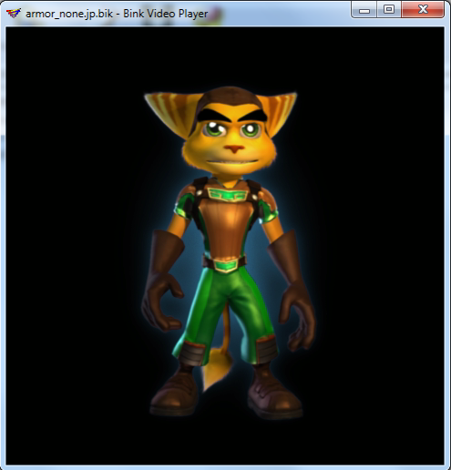
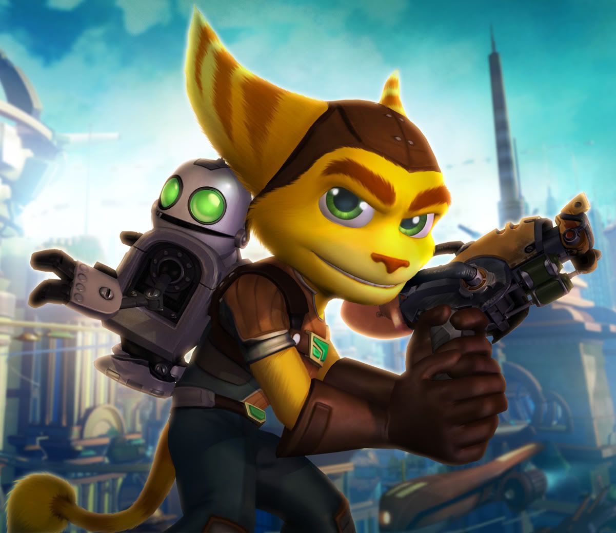
I have to agree that the model was subtly modified to make it look better, but overall the model that was used for PS2 can't be upscaled. Instead, the model used for that picture which is in HD is vastly different from the old PS2 model, it's some kind of a "how it should have been if there were no hardware limitations" -model. There might be several problems for using that like missing animation and bending points necessary to create an in-game model out of it.

But yeah, I agree the eyebrows are a bit cartoony. The ears also have a difference as you noted, in which I prefer that HD variant of the old model (once again, that isn't used in the old games but only for promo art) better.
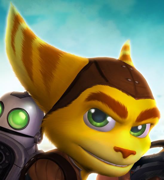
The reason Ratchet's face looks less furry except cheeks and jaw is that it lacks gradients in the middle part of the face. When there are no gradients, the furryness doesn't show up. That has been tried to be fixed for ACiT but as of now, the PS3 wouldn't be able to handle realistic fur like that in the PS2 promo model.

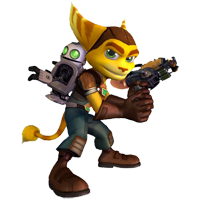
Don't you think this pretty much catches the furriness of the old model (tho the eyebrows are still a small issue)? Just like the one I posted earlier and that PS2 promo art model, it isn't the one used in-game, or at least PS3 doesn't use it on a resolution high enough for the characteristics of the fur to become completely visible (again right-click and choose "view image" for full size):
User image

But I think we can agree that the exact model used in the PS2 games isn't the best one, but that HD one with the old characteristics you posted? It has neither the issue with the eyebrows, fur, enormous eyes, hands (seen in other promo art using the same model) nor out-of-proportion head.

User image

Just keep in mind that it shares most of the characteristics with the 3D model used in-game, but it isn't the same, so the in-game model *can't* be upscaled to look like that.

Ratchet should also get that Megacorp helmet (or technically it isn't identical to the helmet in GC, but the same style) back. It fits well.

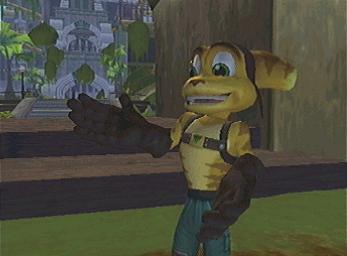
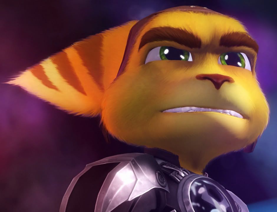
Finally, at least the eyebrows aren't as cartoony as they are in the Japanese games:
User image

Yeah,the Japanese games are just…fake.
and i also notice,the cheeks of older Ratchet is more…in,not sure how to say it,but it's more closed in and realistic.The new ratchet has a sort of a chipmunk cheek.The cheek bones are widened and lowered down.
but i do agree with you
but i find it weird how the PS2 can catch more realistic features (other than the sharp-cornered parts of a character)than the PS3.Sure,the PS3 has Blu-Ray,but for the cost of reality?
but despite (meaning:Without being affected by) the fact that the old ratchet may had glitches in the un-cornered parts (eg: Chest),He did look very good and realistic.
I think that Insomniac had the chance to make the Old Ratchet HD,in fact,it was very likely and very possible for it to have appeared on the R&CF series.
But not only did Ratchet Change.
I hate how Captain Qwark may look realistic,but worse than before.Just a thought.

Chipmunk cheeks… I haven't thought about that. The cheeks aren't only widened, but also brought backwards into Ratchet's head. It's partly caused by the colour of the fur in his face, but the cheeks really are further backward in his face. The PS2 model has more human-like proportions except those eyes.

Another "cartoonisation" of Ratchet was changing the waist-shoulder proportions. In the older games Ratchet's waist is wider compared to the newer ones while the shoulders are at least as wide. IG explained it was done to allow better animation of the model, but this also subtracts from the realism, or what we find more realistic, human-like proportions.

About Qwark, well, I never liked his model in the old games, but the new model feels just "plastic" because of the texturing.

yes,it's plastic,that's it
what other way to describe it emoji
Qwark is a walking action figure emoji

and also,they shouldn't have done the shoulder's like that
i've noticed that too,and i've been angry because of how Insomniac changed every thing!

if it's supposed to be futuristic,why did Ratchet change from realistic to cartoony?
if that's what they think the future will be like,i don't know what to tell them…

and like i said.He has chipmunk cheeks.Doesn't it look like you can pinch his cheeks and squish them?
On the old model,it looks more tight and more realistic of the lombax

and also,as seen on this image:
User image

the mouth is flat and there are no lips…

Deleted user
if it's supposed to be futuristic,why did Ratchet change from realistic to cartoony?
if that's what they think the future will be like,i don't know what to tell them…


I think Insomniac just wanted to find an art direction that suits Ratchet and Clank the best. Not every futuristic setting in a story from a movie, show or game has to be realistic. What about Futurama? That takes place in the future and it's an animated sitcom.

Your statement about Insomniac changing the series from realistic to cartoony I disagree with. Ratchet and Clank has always had cartoony motifs in their animations and style, but in contrast with the execution of the final product.

The PS2 games were a bit gritty in appearance, but the animations were exaggerated at times. Look closely in the cinematic sequences anytime Ratchet, Clank, Qwark or any other character fell off from a high cliff for example. The PS3 character designs are colourful and loose in their animations, though not as exaggerated as the ones in the PS2 games. You do convince a good point about the characters looking a bit too plastic like Qwark for example, but in my opinion the form of the characters for the PS3 titles is what makes them stand out a bit more. Perhaps I'm just the type that is open to exaggerated and vibrant designs.