Thread: Ratchet & Clank: Into the Nexus

That's because of the angle, it usually looks much nicer. For GameCube this was really ambitious, you'd think that on the PS3 we'd see something a little slicker than what IG did with Nexus.

User image
That's because of the angle, it usually looks much nicer. For GameCube this was really ambitious, you'd think that on the PS3 we'd see something a little slicker than what IG did with Nexus.

User image

I think Ratchet looks much better in ItN than Star Fox in the GC games.
I like fur but I don't like too much fur.

Hey, it's 2002 vs 2013 here. But even without the time distance, I wish to see Ratchet more like Fox in SF Adventures.

And I couldn't help but notice:

User image

*named Fox McCloud
People think you're called Star Fox

A friend of mine recently pointed that out too. But Andross refers to the StarFox team, teasing Fox with his father. But that's a story for antoher time.

I believe we had this disuccusion alreayd. In a special topic dedicated to it in fact.

I believe we had this disuccusion alreayd. In a special topic dedicated to it in fact.

Ooops, I think we did…

I never realised how much he was tempting fate at the end of the cutscene.

Not really.
It looks washed out and the pop-in is horrendous.

pop-in?

Well, the resolution is lower, but it's got nicer visual effects. And Talwyn's mouth bug is not visible.

EDIT
I'm making a comprasion right now… there are actually more differences beetwen these two than just the bloom…

As I said look at the pop-in.
It's very noticeable when the camera is zooming into the Nebulox.

Okay, here it is, final game on the left, beta on the right:

User image


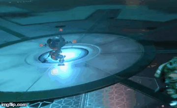
The animation and character models are exactly the same in both builds. But as you can notice, Nebulox's much (MUCH) more detailed in the final build, except for the moment, when they're talking to Talwyn - in the beta you can see some damaged parts of the ship, that are not present in the new version. Both cutscenes are differently rendered - the beta's got some additional visual effects, while the final version lakcs them. But when I look at these pictures… I think it's good they got rid of it, the beta's just more shiny… Too shiny actually. While it makes the holograms and metal look much better (look at Clank), there's just too much bloom, everything's annoyingly shiny. I don't think deep space is that bright. So, I gotta admit - despite making Clank look like he's made of paper, the final render is better.

Correct me if I'm wrong but isn't his fur different too?